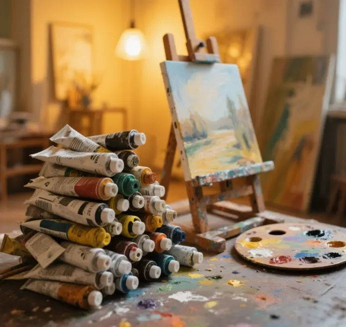
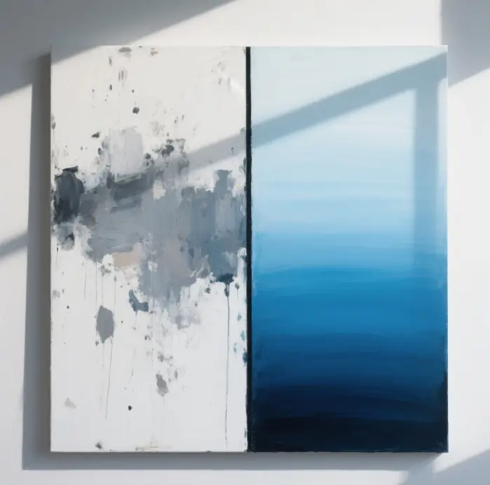
Oil painting is known as the “king of the painting medium,” not only because its thick pigment can be preserved for hundreds of years but also because it can produce a variety of colors, especially in terms of plasticity. However, many beginners in color mixing often encounter “dirty color,” “gray surface,” and “dry crack,” these problems; in fact, it is not that our hands are not clever, but rather that the structure of the color wheel, material chemistry, and layering principles are not well understood. It’s not that we are not good at it, but we don’t know much about the color wheel structure, material chemistry and layering principle. Today, Mr. Xiaosun will combine many authoritative resources, as well as museum restoration codes and teaching experience, to give you a good talk about how to mix oil paint.
Why is color mixing central to oil painting?
The slow-drying properties and layering advantages of oil paints
The dry oils used for oil painting, such as linseed oil and poppy oil, will slowly oxidize in the air and form a solid, reticular film. This property allows us to have two different ways of creation: one is wet painting, and the other is layering and overpainting. Because the pigment dries slowly, the colors have enough time to blend on the screen. However, if the bottom layer of color is not mixed properly, it can affect the top layer of color before it dries completely. That’s why accurate and stable color matching is especially important when layering colors one layer at a time.
“Dirty Colors and Light Stability: The Cost of Color Mixing Mistakes
“Dirty color” is generally caused by three chemical reasons: first, the proportion of complementary colors is not properly controlled; second, opaque and transparent colors are applied in the wrong order; and third, excessive solvent is used, resulting in non-uniform color powder distribution. In addition to the color not looking good, mixing colors when adding too much white also reduces the light stability of pigments, meaning the color is more likely to fade under ultraviolet radiation.
Three major benefits of systematically mastering color mixing for creative work
- Improve efficiency: By mixing the color formula in advance, you don’t have to experiment on the fly when painting, and you save time waiting for the paint to dry.
- Maintaining stylistic consistency: By mixing colors in a uniform grayscale and saturation, a series of paintings put together will have coordinated colors.
- Reduce material waste: by mixing colors accurately, you won’t have excess paint that goes to waste, and you’ll save on expensive professional-grade paints.
Preparation for color mixing: tools and materials
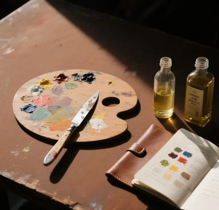
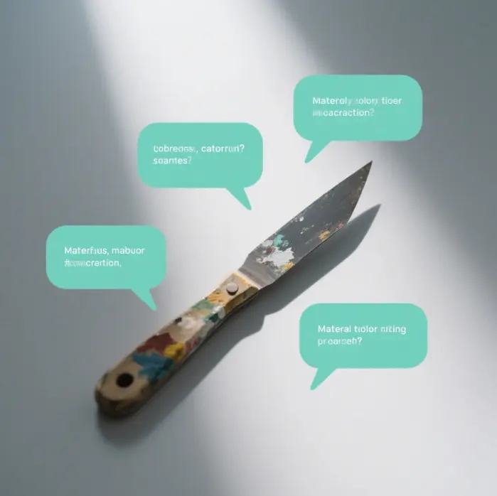
Palette Knife vs Paintbrush: Advantages and Disadvantages of Color Mixing Tools
The blade of a palette knife is very sharp, and it is easy to scrape the paint off after use so that different paints won’t remain on the blade and contaminate the next color. Brushes can only be used to blend colors slightly in a small area or to mix colors when painting wet. If you use a brush to mix colors over a large area, the bristles wear out quickly, and you tend to mix dirty colors. So, the general authority of the teaching recommends mixing colors with a palette knife and painting with a brush.
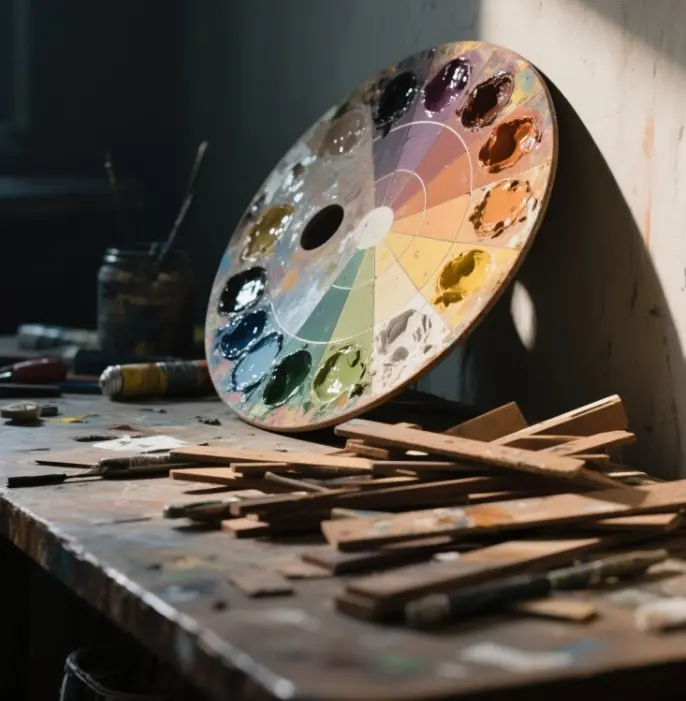
Palette choice: wood, glass, a torn paper comparison
| Quality | Pros | Cons | Scenarios |
| Wooden boards | Very light and comfortable to hold | Difficult to clean | There is no need to clean, very time-saving |
| Glass | Easy to scrape clean, can judge the color depth objectively | Heavier | Indoor fixed working table |
| A torn paper | There is no need to clean; it is very time-saving | Opaque, easy to judge the color shade bias | Classroom, often do demonstrations |
Solvents and media: the role of linseed oil, OMS, Alkyd
- Odorless Mineral Oil (OMS) makes the pigment less viscous and more fluid and does not leave traces after evaporation.
- Refined linseed oil enhances the pigment’s gloss and transparency, making it suitable for over-dying at a later stage in the painting process.
- Alkyd Medium: It can make the pigment dry on the surface in 24 hours, which solves the problem of having to wait for a long time for one layer of paint. However, if you add too much, the brushstrokes of the pigment will become thin.
When mixing colors, the golden ratio of solvents, oils and pigments is 1:1:4, with a few adjustments depending on the weather and painting method.
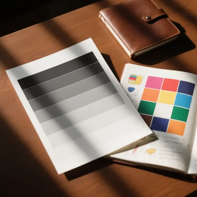
Color Diary and Sample Cards: A Method for Recording Color Mixing Recipes
Cut small cards out of 300g oil paper and record on each card the formula of the pigment, the ratio of the medium, the drying time, and the change in color after 1 week of light exposure. Over time, you can build up your color-matching database. In the future, when encountering complex colors, look at the card can quickly mix the same color.
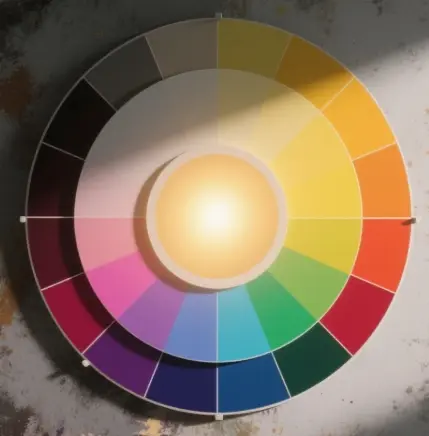
Color Wheel Basics and the Finite Palette
Primary and Secondary Colors: A Quick Look at the Structure of the Color Wheel
RYB’s Primary colors that is red, yellow, and blue, two mixed to get orange, green, purple, and three secondary colors. Mixing the secondary colors with adjacent colors results in six intermediate colors. Knowing these 12 color divisions, we can quickly determine the shortest way to transform one color into another.
Warm/Cool Bias Determination
Even if the color has the same name, there may be a difference between warm and cool colors in different brands or batches. To determine the color, compare the desired color with the base color on the color wheel. If it is closer to yellow, it is a warm color; if it is closer to blue, it is a cool color. When mixing colors, combining colors with the same warm and cool tendencies can make the colors more saturated. Conversely, mixing colors with different warm and cool tendencies can help create gray tones.
Advantages and examples of a limited palette (3-7 colors)
- Three-color limit: with titanium white, phthalocyanine blue, red, deep and cadmium yellow in the three colors, we can train our ability to fine-tune the color.
- Five-color classic: Based on the three-color classic, with the addition of mature ochre and ivory black, we can adjust the grayscale more accurately.
- Morandi Seven Colors: Add yellow ochre and ultramarine, and you’ll be able to mix the colors of most of life’s still lifes.
- Using a limited palette creates a more harmonious picture and doesn’t rely too heavily on the colors already in the tube.
Earth Colors: The Neutralizing Function of Ochre, Brown Earth and Yellow Earth
Most of the earth’s colors are natural iron oxides that are particularly light-stable. Adding a little earth color to a color makes the complementary colors mix less abruptly and is a good way to quickly reduce the saturation of a color. Landscape painters often use yellow ochre and ultramarine to produce serene shadow colors, such as Payne’s Gray.
12 Practical Tips for Mixing Colors (5 blueprints)
- Mixing colors from light to dark: Start with a white base and gradually add other colors, allowing you to control the brightness of the colors more accurately.
- Pre-tuning Color Strings: Divide the colors into 5-7 squares of lightness and arrange them in a series so that the tone of the colors remains consistent throughout the painting.
- Reduce Saturation with Complementary Colors, Not Black: Using complementary shades of color does not make the colors “dirty black” and gives the image a sense of light.
- Mix no more than 2-3 colors at a time: Mixing too many colors at once will increase the likelihood of the colors becoming muddy.
- Transparent colors are added first, and opaque colors are added later; this maintains the optical depth between color layers.
- Mixing with a palette knife: Mixing with a palette knife reduces the risk of contaminating the next color with residual pigment on the brush bristles.
- Test a small sample before applying it to the canvas: Paint a stroke on the edge of the canvas and wait for it to dry to see if there is any difference in color before deciding whether to use that color.
- Stop adding white to correct brightness with a grayscale. Adding too much white will reduce the saturation of the color; therefore, it is better to use a grayscale to adjust the brightness.
- Separate the brush from the blending area: It’s easier to keep the color pure by using a dedicated brush for the same color.
- Follow FatoverLean: The top layer of color oil should be thicker than the bottom layer, which can help avoid cracks in the picture.
- Eco-friendly solvents and ventilation: Maintain VOC levels below 500 ppm to protect our health.
- Continuously keep a color diary: Write down the situation of trying the color, the environment at that time, and the ratio of the medium so that you will have a basis for mixing the same color next time.
Case Study: Color Mixing Strategies of Famous Artists
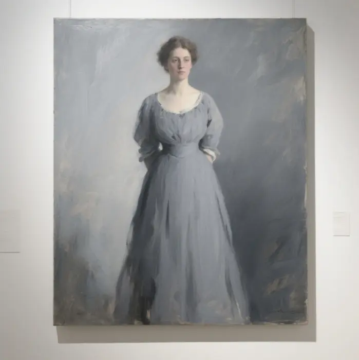
John Singer Sargent’s “stringing” of gray tones.
When Sargent painted portraits, he often used 4-5 strings of grays, ranging from the darkest Payne’s Gray to Titanium White, with a cool gray in between. This ensures that the skin tone of the figure matches the color spectrum of the background. The lips and ear tips are then painted in localized areas with very bright, warm reds, which keeps the viewer’s attention focused on these areas.
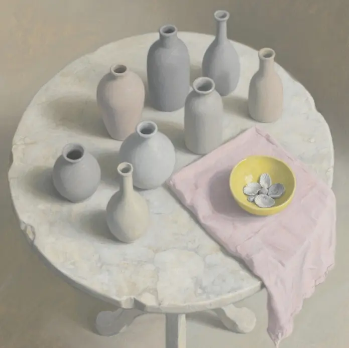
Morandi’s still life in high-gloss neutral gray
Instead of using almost pure black, Morandi uses ripe browns and ultramarines to bring out the darker colors, which makes the grays look more breathy. By allowing the colors to shift in warmth and coolness, he made the still life look especially peaceful and spacious, exemplifying a “limited color palette” used exceptionally well.
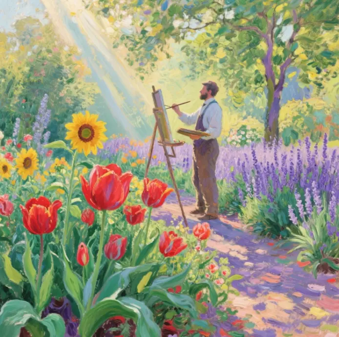
Complementary vibrations of light and color in Impressionist outdoor paintings
Monet and Renoir often put complementary colors together rather than mixing them evenly. Such tiny brushstrokes create an optical mixing effect in our eyes. The brighter the light in the scene, the more contrasting the complementary colors are, and the more shimmering the image looks.
Common Mistakes and Corrections
- Mixing too many colors at once can lead to turbidity. Use a palette knife to add colors little by little, and scrape the edge of the knife clean after each use.
- Unthinkingly using black to deepen the color can cause the picture to lose its vibrancy. Instead, use complementary colors or deep, earthy colors to reduce the saturation of the color.
- Neglecting the proportion of oil can cause dryness and cracking. To address this, add at least 10% more oil for each new layer of color or use Alkyd to balance the proportions.
- Fogging of color layers due to solvent abuse → Use solvents in small amounts only on the bottom layer, and the higher you go, the more oils you use.
FAQ: The most concerned color mixing questions for newbies
Q: How can I make shadows richer instead of pure black?
A: Mix with complementary colors; for example, combining Ultramarine and Burnt Ochre creates a warm, grayish-purple. Then, layer a little more of the object’s color around the edges of the shadows, ensuring that the shapes and colors of the shadows are consistent.
Q: Why are my skin tones always gray?
A: The key to a good skin tone is “gray with red.” First, use titanium white, ripe ochre, and ultramarine to create a cool gray tone, and then add a little cadmium red or yellow ochre to balance the warm and cool colors. The important thing is to reduce the saturation of the color first and then adjust the hue.
Q: Can I mix different brands of pigments?
A: Most modern brands of pigments can be mixed and used together, but be aware that the oil content of transparent colors may be different. It is recommended to try the colors on the swatch first and wait for 7 days to see if the colors will stratify or bleed.
Q: Will fast-drying mediums affect color purity?
A: Standard Alkyd is very transparent and has minimal impact on color. However, if you add more than 20% at a time, the risk of drying and cracking will increase. It is safer to keep it at about 10%.
Advanced Resources and Practice Paths
Recommended Exercises
- Complementary Grayscale Strips: Slowly mix complementary colors in 9 squares to train our ability to control color saturation.
- Experimenting with monochromatic bases: Use a raw brown or green base color to see how it affects the overall color of a later painting.
- Five-stroke limited practice: only five strokes for each color, which can train our ability to anticipate the color and make decisive strokes.
Online Courses and Books
- Color and Light (James Gurney) – teaches us visual logic and control of grayscale.
- Oil Painting Techniques and Materials (Michael Jacobs) — A systematic introduction to oil painting materials.
- New Masters Academy Color Matching Special: The instructor will demonstrate the whole process of oil painting color mixing step by step.
Long-Term Enhancement Program
- Quarterly review of your color diary to compile common color formulas.
- Make your own “personal color chart” every six months, labeling the batches of pigments and the results of light tests.
- Every year, choose a new theme, such as thick paint, overdye, or knife painting, and focus on the attack so that our techniques and picture effects can be richer.