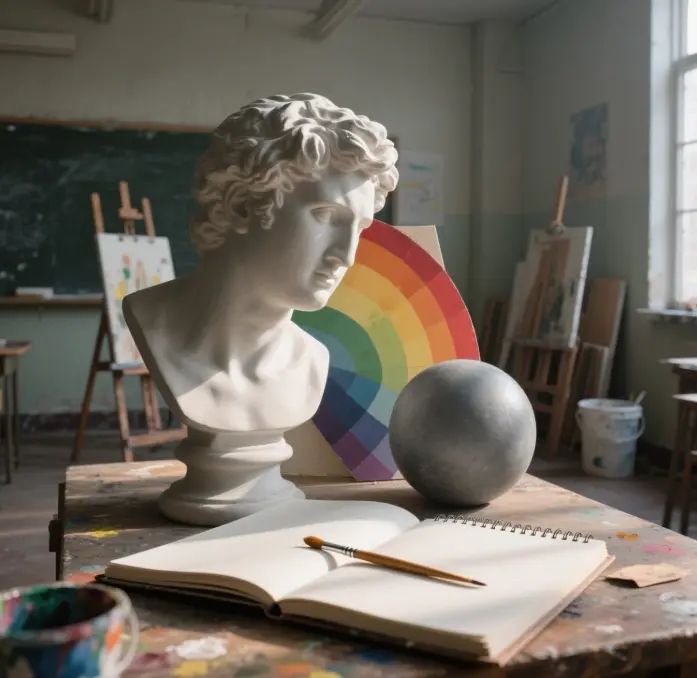
Do you want to start oil painting but don’t know where to start? Don’t worry; this is to arrange a super-detailed beginner’s guide; let’s step by step into the wonderful world of oil painting!
Understand and prepare oil painting materials and tools
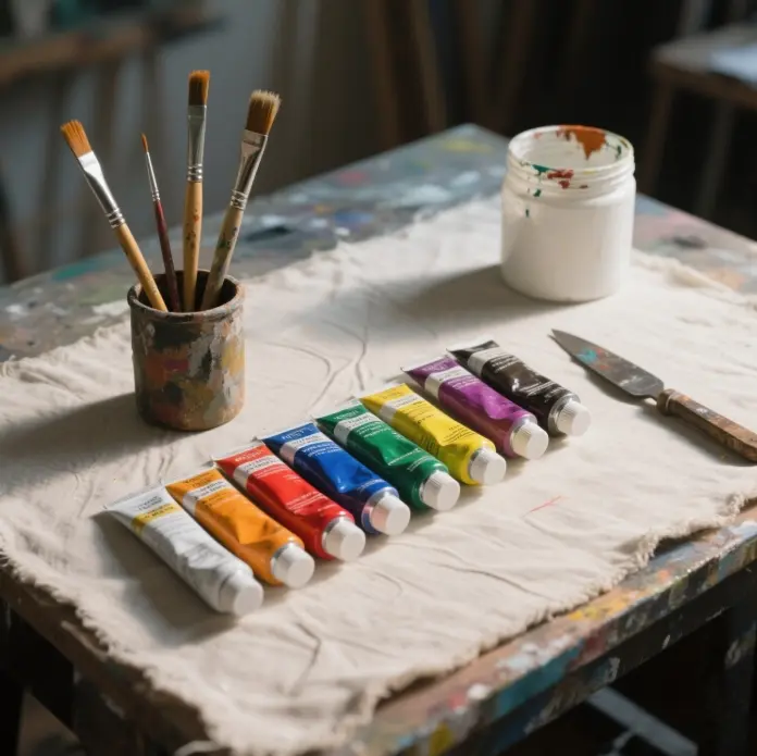
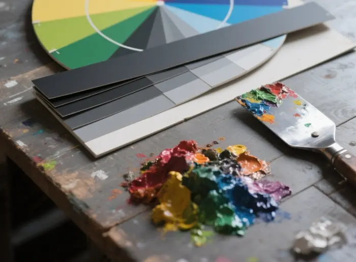
Pigment selection: Beginner’s Palette
A lot of newcomers to the idea of “buy all the colors” result in a lot of money, but also, because there are too many colors, they do not know how to match, and in the end, they are left blindfolded. In fact, the international mainstream oil painting course recommends beginners with a “limited palette” to start. Like titanium white, ivory black, cadmium red, cadmium yellow, ultramarine, phthalocyanine green, and ripe ochre, these seven colors can be mixed to create more than 90% of the colors used in our daily lives.
In the actual painting, you will find that titanium white can be very powerful;; it can not only make the color bright but also reduce the partemperature of ticularly bright colors tovory black and white, after mixing, can be adjusted with the blue phase of the cold gray, then directly with ultramarine out of the gray to more “clean”. If we are on a budget, student-grade paints are fine for practicing. When we work on a project for an extended period or plan to sell our paintings, we can gradually change them one by one to professional-grade tube colors, ensuring the color of the paintings remains unchanged even after decades, thanks to ASTM International’s light fastness standards.
Brushes and Palette Knives: Specifications and Materials
If you’re starting, you don’t need to buy too many brushes, but you can begin with one hard and one soft. Two #10 hog bristle flat brushes are ideal for underpainting and creating thicker strokes, while one #4 sable round brush is suitable for detailing and making edges appear natural. Hog bristles have a lot of keratin in them, and the bristles are very hard, so they give a very distinct texture when painting on coarse-grained fabrics. Sable hair contains less oil and has good elasticity. Indeed, the paint is not yet dry on the painting, which allows for a very soft, translucent transition effect.
A palette knife is also important. A fine-pointed knife (5 cm) can be used to scrape off mistakes and to draw lines; a medium-sized knife (8 cm) can be used to mix the pigments; a large knife (10-12 cm) can be used to spread the pigments almost 1 mm thick at a time, giving the effect of three-dimensionality. It’s best to choose a stainless steel blade so that turpentine won’t corrode it, and it’s easy to clean.
Supporting surface: canvas vs board
When we first start practicing, a 30 x 40 cm pre-painted acrylic-backed cotton board will suffice; it’s inexpensive and the right size. For a more professional look, you can also opt for a linen canvas with double oil priming. Linen has wax in its fibers and absorbs less water, which greatly reduces the problem of “oil sinking.” If you often need to take your painting equipment with you, a 300 g oil paper pad is a particularly good choice. You can paint on it, scratch on it, try it out with a knife, and you don’t have to worry about wasting material.
Coloring oils, turpentine and other media
The most basic solvent combination is “Odorless Mineral Oil (OMS) + Refined Linseed Oil.” OMS can be used to dilute pigments and clean painting tools, while Refined Linseed Oil can be used for overpainting and applying thicker coats. If you think the paint dries too slowly, you can add 10-20% Alkyd medium in the middle and late stages of the painting, allowing the surface of the paint to dry in 24 hours. Turpentine evaporates quickly but has a high concentration of VOCs and a strong odor; therefore, it is recommended that it be used sparingly in a well-ventilated studio. Regardless of the solvent used, it should be left to settle after use. The clean liquid above can still be used, while the sludge below should be sealed and handed over to a facility specializing in the treatment of hazardous waste after it has been dried.
Canvas Pretreatment and Safety
Even if we are buying a finished canvas, we need to see if any cotton fibers are showing on the back. If there are, brush the canvas with a 1:1 mixture of OMS + linseed oil and wait 24 hours before starting to paint. Otherwise, the oil in the paint will be absorbed by the fibers, resulting in a gray color.
Ventilation is crucial for safe painting. If we have a limited budget, we can open the window diagonally and put a desktop fan; if we have better conditions, we can install a fresh air ventilation system with 250 m³ of air exchange per hour and an activated carbon filter. If you have to paint for a long time, it’s best to wear an A2-grade activated carbon cartridge mask so you won’t inhale alkane, which is harmful to your nerves.
Laying a good foundation: Sketching and color training
Sketching: Form, Structure, Light and Shadow
Sketching is not just about drawing in black and white; it is about training our “structured observation” skills. It is the ability to break down a complex object into basic geometric shapes, such as spheres, columns, and cubes and to discern the direction from which light is coming by observing the light and darkness in different areas. After learning this method of analysis, we will be able to quickly see the perspective of the object when we draw the first draft of the oil painting rather than drawing randomly based on our feelings.
It is recommended that you start with plaster geometries that have only one source of light and then slowly paint still lifes and plaster statues with richer textures. After each practice, use the eight-step gray card to check the correct level of light and darkness in your drawing.
Color Theory: Primary Colors, Grayscale and Contrast
The traditional RYB primary colors (red, yellow and blue) are not the only standards in pigment, but they make it easy for beginners to understand the laws of color contrast. When complementary colors come together, their saturation is reduced, and when mixed, they tend to become close to neutral gray. When we practice, we can use titanium white, ultramarine, cadmium yellow medium, and cadmium red deep to mix out different grayscale bands, allowing us to see the color changes resulting from varying ratios of warm and cold tones. Understanding how to make the color “desaturated” is more important than just thinking about painting the color “bright” because, in reality, there are few pure colors; most of them are intermediate colors with a little gray.
Observation and Copying: Learning from Famous Artists
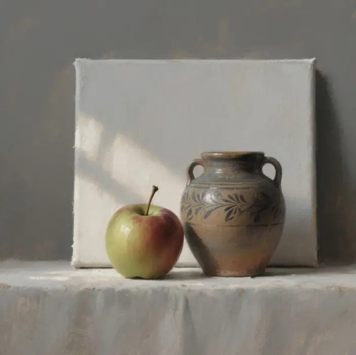
Morandi’s still life paintings or Impressionist landscapes are chosen to be copied mainly because of the simplicity of their color blocks. The bottles and jars painted by Morandi have a clear volume relationship, which is especially suitable for practicing the application of cold and warm gray surfaces. Impressionist painters use large color blocks to convey the changes in light and color, which helps us understand the idea of “painting the whole first, and then painting the parts.” When copying, you don’t have to be the same as the original lines; the key is to learn to analyze the color scheme, the direction of the brushstrokes and the rhythm of the color changes.
Starting your first painting: a step-by-step approach
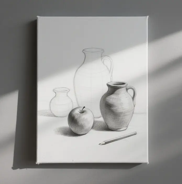
Beginning the drawing: composition and perspective
On a 30 x 40 cm cotton canvas board, use a 6B pencil or a soft charcoal pencil to sketch the outline of the subject lightly, paying particular attention to the points where perspective disappears and the shape of the object changes. You don’t need to go into great detail at this point; focus on getting the proportions and general shape of the object right. If you encounter complex objects, you can use the “cross-positioning method.” That is, first draw a central axis, and then on the left and right sides, and the corresponding edge so that the error becomes smaller.
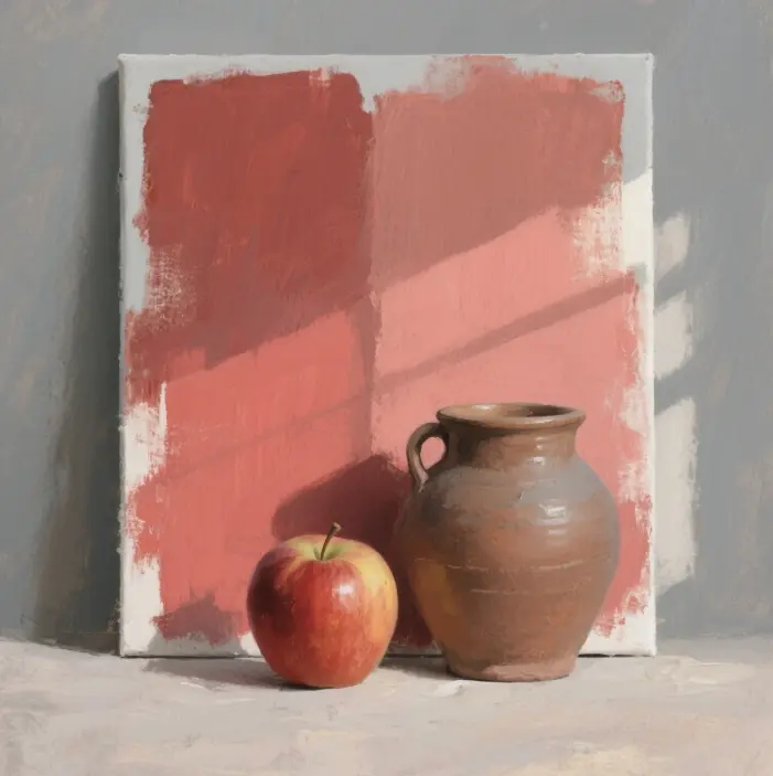
Laying out large blocks of color: main colors and shading.
Create a semi-transparent liquid with a small amount of OMS to cover the white of the canvas so that it won’t be too blinding. Then, use 1:1 titanium white and the main color to paint the bright areas in the foreground, and use cool gray mixed with ivory black to paint the dark places in the background. The key is to use large blocks of color rather than lines so that others can discern the warm and cold tendencies of the picture and identify where the light comes from. If you get this step right, it will be much easier to refine it later.
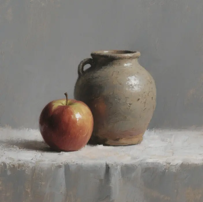
Layer by layer: from deep to light
There is a principle in oil painting called “Fat over Lean,” which means that the first layer of paint contains more solvents and fewer oils, and the proportion of oils in the second and third layers increases slowly. When the lower layer dries with your finger, you can use 75% opacity paint to paint the highlights and then use translucent paint to paint the darker areas, making the color more pronounced. It is best to wait until the painting is almost 80% dry before painting it all at once, or else it will destroy the three-dimensionality of the object if it is repeatedly brushed in the middle.
Finishing and drying: varnishing, signing and protection
The surface of the painting can be lightly touched in about a week, but it may take three to six months for it to dry completely. If you are in a hurry to participate in an exhibition, you can spray a layer of quick-drying varnish on the surface after it has dried for a week to protect it. When it is completely dry, apply Damar varnish or synthetic varnish. When signing, use a small sable brush that matches the color of the painting, and avoid using a color that is too conspicuous, as it may detract from the main body of the painting. When storing the painting, maintain a temperature of 21°C and a humidity level of 50%, and keep it away from direct sunlight.
Mastering Common Oil Painting Brushstrokes
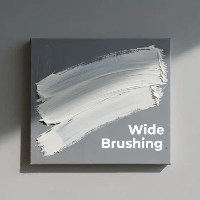
Erase, Pull, Lay, Brush, Knead: Brushstrokes and Texture
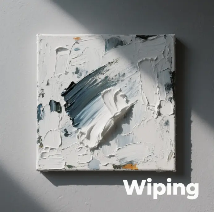
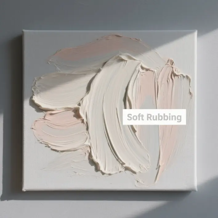
- Erase (rubbing): Use the belly of the brush to gently wipe the paint that has not yet dried, melting the edges, which is suitable for large areas of the painting, particularly the underlying gradient.
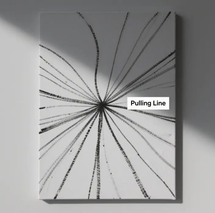
- Pull (pull line): Use the tip of a knife or a stiff-bristled brush to quickly draw the edge of the light, highlighting the glass or the reflections of metal.
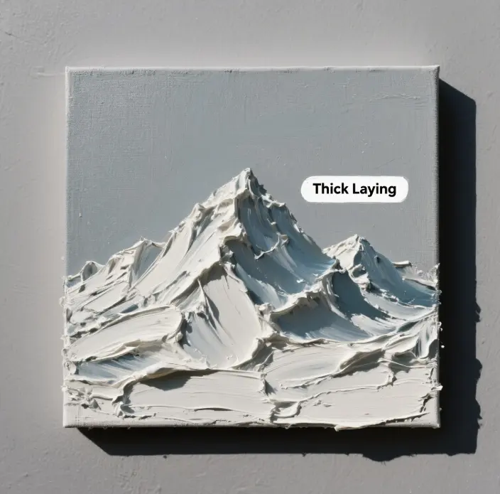
- Laying (thick laying): Use a palette knife to scoop a large piece of paint directly and lay it on, creating a three-dimensional sense of texture. This technique is often used when painting flower petals or snowflakes.
- Brush (wide brush): Dip the brush into a thin color solution and quickly sweep it across the screen to expose the fabric pattern, making the screen more breathable.
- Kneading (soft kneading): Use a clean, soft brush to gently blend the area where the two colors meet, mixing the colors slightly to create a smoother transition.
Stippling, Pendulum, Scratching, Sweeping: Enriching Picture Expression
Stippling can create a shimmering effect; the pendulum can create a cutting effect, a one-way scratching brush has a sense of speed, and a sweeping brush can make a floating texture; each brush technique has its unique visual effect. When we practice, we can use the same still life with different strokes to paint it once, allowing you to see the difference between them very intuitively. For example, the pointillist version focuses more on light and color changes, while the knife version shows more color and texture.
When to Use the Brush and When to Use the Knife: Switching and Contrasting Techniques
Generally speaking, 70% of the picture can be painted with a brush, allowing the color layers to be more subtle and nuanced. For the last 30%, you need to highlight the volume and focus of the object. Use a palette knife to draw a contrasting texture that will make the subject stand out more. Mastering when to use the brush and when to use the knife, just like learning the rhythm of music, will make the viewer’s eyes more comfortable when looking at the painting.
Color Mixing and Matching Techniques
Three primary colors mixing exercise
Use titanium dioxide to mix with cadmium red dark, cadmium yellow medium, and ultramarine to create a 9-grid gradient, and observe how the color’s warmth or coolness changes as the proportions shift. Then, mix the three primary colors to find the proportion of neutral gray. Through this exercise, we will be able to build up a “color map” in our minds, and when we see what we want to paint, we will know how to mix the colors rather than adding paints randomly according to our feelings.
The use of contrasting colors in shading
Shadows are not simply adding black; it is actually a local color saturation reduction, slightly in the direction of the complementary color change. For example, for the shadow of the warm white wall, you can add a little bit of ultramarine on the basis of brown; for the portrait of the cold shadow, you can add a little bit of yellow ochre in ultramarine + cadmium red depth so that you can retain the feeling of cold. Still, you will not make the color look dirty. Contrasting colors in small doses can give the picture a little shimmer and will not look “dead gray.
Color Mixing Guidelines to Avoid Dirty Colors
When mixing opaque and transparent colors, if you don’t mix them in the right order, the colors will become muddy. The rule of thumb is to paint transparent colors first, then opaque colors; paint cool colors first, then warm colors; paint low-saturation colors first, then high-saturation colors. Every time you use the palette knife to change the color, be sure to scrape the top of the residual paint; otherwise, the residue of different colors will mix, and the next color will not be pure.
Practice and Grow: Creating an Effective Learning Path
Exercise program: step-by-step themes
Stage 1: Drawing plaster geometries with the goal of mastering the five major tones of light and dark.
Stage 2: Painting still life, such as bottles, cans, pieces of cloth, and wooden boxes, to train the painting of cold and warm gray surfaces and the texture of the object.
Stage 3: Paint outdoor landscapes or portraits to test your ability to grasp the structure of objects, colors, and atmosphere in a picture.
For each stage, it is recommended to draw at least 15 small sketches and three detailed works to improve.
Error Correction and Iteration: Utilizing Oil Painting’s Error Tolerance
The advantage of oil paintings is that they can be overpainted. Even if you are not happy with a painting, you can gently scrape it off with a knife, smooth it out with a brush, and paint another layer. It’s essential to document the issues in the painting, whether it’s a crack in the color layer, the objects are not in the correct proportion, or the colors appear dirty. Please write down the problems and work on them. After 30 paintings, the number of mistakes in your paintings will be significantly reduced.
Seek feedback from teachers, fellow artists and the online community.
Regularly letting others review our paintings allows us to identify problems that we may not notice. Whether it’s an offline studio or an oil painting community on Reddit or Instagram, posting high-resolution photos of your paintings, along with your comments, and asking your peers for advice will help you improve faster than if you were to paint by yourself. Remember, it’s the painting they’re criticizing, not the person who created it.
Frequently Asked Questions (FAQ)
Common Material Misconceptions for Beginners
Misconception 1: Buy all 24 premium colors at once. There are too many colors, but we don’t know how to match them, and many of them will dry up in the tube if we don’t use them.
Misconception 2: Blindly buy a big canvas. The larger the canvas, the more we test our ability to grasp the picture as a whole, so we recommend starting with an A3 or smaller canvas.
Myth 3: Use industrial turpentine to save money. Industrial turpentine contains benzene impurities, which make it particularly pungent and toxic.
What to do if the oil painting dries too slowly
Raise the room temperature to 24 °C and lower the humidity to 40%, which can reduce the drying time by 20%. You can also add 15% of fast-drying alkyd to color mixing oil or use a cobalt-based drying agent; however, the concentration should not exceed 2%, as this can cause the painting to crack easily.
How to safely dispose of solvent waste liquid
After the solvent is used up, leave the mixture for three days to allow the pigment particles to settle to the bottom. The clean solvent on top can be poured back into the can and reused. At the same time, the sludge on the bottom will dry naturally and then be placed in a sealed bag labeled as “Oil-based Hazardous Waste” and taken to a local recycling station specializing in the treatment of hazardous chemicals. Never pour solvents down the drain.